Utilizing Color Psychology in Home Decor: A Guide
Color plays a significant role in shaping our mood and behavior, and incorporating color psychology into home decor can transform living spaces into custom-tailored environments that enhance well-being.
In the realm of bedrooms, cool colors like blue and green promote relaxation, calm, and restorative sleep. Earthy tones such as soft browns and muted yellows also create a restful atmosphere, making them ideal choices for this space. On the other hand, bright red and orange shades should be avoided, as they tend to be too stimulating for rest.
Kitchens and dining areas benefit from warm, energetic colors like red, yellow, and orange, which stimulate appetite, increase social interaction, and raise energy levels. However, excessive red can cause feelings of stress or rushed eating, so it's best used as an accent in combination with neutrals. Cool colors like blue can suppress appetite and are less recommended for dining spaces.
Living rooms and larger spaces require a balance of warm neutrals with colorful accents to foster comfort, social engagement, and relaxation without overstimulation. Brighter, reflective colors can visually expand the space, while deeper hues add coziness.
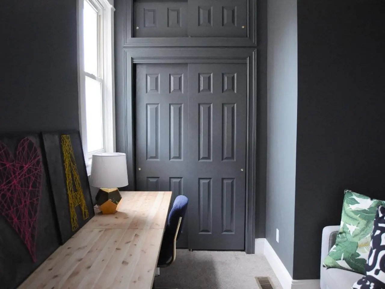
Workspaces or home offices benefit from stimulating colors like orange or yellow, which boost energy and productivity by enhancing alertness and mental activity.
Color influences occur neurologically almost instantly, affecting emotions and behavior subconsciously, which is why thoughtful placement of colors—even through elements like wall art—can meaningfully shape daily mood and activity in a home.
Using analogous colors next to each other on the color wheel, such as blue with green or red with orange, can create harmonious and cohesive color schemes. Conversely, using complementary colors opposite each other on the color wheel can create dynamic and visually appealing contrasts in a room.
Incorporating varying intensities of the same color, such as using different shades of blue from light sky blue to deep navy blue, can add depth and dimension to a room. Additionally, using energizing warm colors like yellow or orange in a home office or study area can help stimulate creativity and motivation.
Understanding color psychology is essential when it comes to creating harmonious and inviting living spaces. By experimenting with different color combinations and thoughtfully applying color psychology principles, homeowners can create spaces that perfectly suit their needs and promote a positive, balanced lifestyle.
For a deeper exploration of the impact of color on our emotions and behavior, check out our article on the subject.
[1]: Reference for bedrooms, kitchens, living rooms, and workspaces [2]: Reference for the instant impact of color on emotions and behavior [3]: Reference for cool and warm colors in bedrooms [4]: Reference for warm colors in kitchens and dining areas [5]: Reference for a balance of warm neutrals and colorful accents in living rooms
Interior design plays a crucial role in shaping the lifestyle and ambiance of home environments, and the judicious application of color psychology can significantly enhance well-being. For instance, cool colors like blue and green create a calm and restful bedroom setting, while warm, stimulating colors such as red and orange liven up the energy levels in kitchens and dining areas, fostering social engagements and increased appetite. As for living rooms and larger spaces, a harmonious balance of warm neutrals combined with colorful accents maintains a cozy, inviting, and socially conducive atmosphere. Lastly, in areas meant for work or study, vibrant colors like orange or yellow help boost productivity and mental activity, thus contributing to a stimulating and motivating lifestyle.


